How Dovey
looks and sounds
One mark, four colors, two typefaces, a way of writing, and one interface. Everything we ship follows this page.
Logo
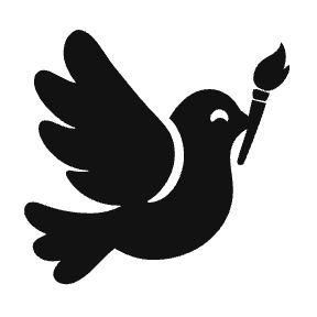
A dove carrying a brush, and the name beside it, both in one color. Ink on light, white on dark. Nothing about it changes except the color.


 Mark
Mark On blue
- Keep clear space around the mark equal to the height of the letter D in the wordmark.
- The wordmark is never smaller than 70 pixels wide. The mark alone is never smaller than 20 pixels.
- The dove and the name are one color: ink on white or surface, white on ink or blue. Nothing else.
- Do not add a gradient, an outline, a shadow or a second color to the dove, and do not rotate it.
- Do not set the name in another typeface, stretch it, or put it inside a shape.
Color
Four colors. Blue is spent on one action per screen, so it always means the same thing: this is the thing to tap.
Ink
#121212
Text, the phone bezel, the dark wordmark background.
Blue
#0033FF
The one action on a page. Selection, focus, and the sent bubble.
White
#FFFFFF
The page. Everything sits on white.
Surface
#F8F8F8
Cards, inactive fills, and the received bubble.
Borders and quieter text are ink at an opacity, never a new hex. These are the three we keep.
- Muted#6B6B6BSecondary text
- Faint#BEBEBETimestamps, placeholders
- Line#F2F2F2Hairline borders
Typography
Faculty Glyphic for the words that carry a page. Inter for everything else, tracked at minus three percent so it sits close and calm.
Display · Faculty Glyphic
Aa Bb Cc
0123456789
Headlines only. Regular weight, never bold, never in a button.
Text · Inter
Aa Bb Cc
0123456789
Regular for reading, medium for labels and buttons. Two weights, nothing heavier.
- 34Text what you wantPage title
- 28How it worksSection title
- 15Reply with changes.Reading text
- 13Text Dovey for FreeInterface
The typefaces inside the posters Dovey makes are a separate, curated set chosen per design. They are not the brand’s own.
Voice
Dovey is read on a lock screen, between texts from friends. It sounds like a person, and it is short.
Say the concrete thing.
Your poster comes back in about a minute.
Lightning fast, AI powered design generation.
Write how a person talks.
What do you want me to make?
Please describe your desired creative output.
Two short sentences beat one long one.
Make it pink. Then translate it to Spanish.
Make it pink, and also, while you're at it, translate it to Spanish.
No hype words.
Posters, menus and social posts by text.
Unlock seamless, game changing design.
No exclamation marks unless something is genuinely worth celebrating. No dashes joining two thoughts. Never a claim we have not measured.
Principles
The rules behind every screen. If a thing does not serve the person, it does not exist.
- 1
One column
The public site is one narrow column at every width. The person arrived from a phone and will finish inside Messages.
- 2
Least text possible
A clear label does not need helper copy. If a sentence is not doing work, it is gone.
- 3
No decoration
No gradients, no illustrations in the interface, no shadows beyond what separates layers.
- 4
Motion is functional
Something moves to show where it came from or where it went. Never for effect.
- 5
Taste is the product
Every choice is weighed against one question: would someone put this in their window?
Shape and space
On the public site cards are 28 pixels round, buttons are pills, fields are 14. One column, 420 pixels wide, 24 of padding. The product's own rules are in Interface, below.
Interface
The product, part by part. The web app, the ad search and the connector widgets are all built from these and nothing else.
Buttons
A pill: a vertical gradient, a 2 pixel inside stroke, a 4 pixel highlight at the top. Blue is the one action on a screen; gray is every other button; dark on ink sections; ghost on the blue field. Heights 36, 44 or 48. Text at 13, medium. Pressed moves down one pixel.
Fields
A search or a message is a 52 pixel pill in the gray recipe with the action inside it on the right. Forms use 14 pixel corners. No borders on focus: the field itself is the frame.
Cards
A product card is 18 pixels round with a hairline border on white; a panel is 18 round on the panel gray with no border. Cards are 14 pixels apart in a masonry that keeps each picture's own ratio. A shadow only where something floats.
Surfaces
- PageWhere work happens. Results, the chat, the brand page.
- PanelA section that steps back: the testing loop, a settings group.
- FieldThe hero and the pricing cards. The ripple grid lives here.
- InkThe connectors section and the dark footer.
Layout and spacing
The app is a 214 pixel rail and a content column up to 1140 wide, 24 of gutter on a phone. Results are 4 columns from 1024, 3 from 640, 2 below. The public ads pages use the same 1140; the rest of the public site stays one 420 column.
- 4 Inside a control
- 8 Between a label and its control
- 14 The grid gap, cards and columns
- 24 Page gutter on a phone
- 36 Between a title and its content
- 88 Between sections
Data blocks
An answer about the ads data is a list of these, in the web app and inside Claude alike.
Stat
One number, one label, no decoration. Ink at 34, label at 12 in muted.
Chart
Bars or a line in blue on white, gridlines in line, labels in muted. One series unless the question compares. No legend when the title says it.
Table
Hairline rows, the first column is the name, numbers right-aligned, a check for yes and a faint dash for no.
Ad carousel
The ad cards, in a row that scrolls, videos playing in place. Remix on stills.
Motion
Presses move 1 pixel in 150 milliseconds. Fades take 220. A spotlight that walks a set of inputs takes 4 seconds a stop. The ripple grid answers the cursor and fades in 650. Nothing loops for effect, and reduced motion turns it all off.
- 1
One action per screen
One blue pill. Everything else is gray. Two blue buttons on one screen is a decision we did not make.
- 2
Content first
The ad, the design, the document is the biggest thing on the page. Chrome is quiet and gray.
- 3
Real data, uncropped
Ads and designs are shown whole at their own ratio. Never a crop, never a placeholder illustration.
- 4
Show the state
A click answers at once: the button turns pending, the page keeps its shape with a skeleton, and results stream in. No spinner that replaces the page.
- 5
Pages have addresses
Every page, search and question is a URL. Back goes to the previous question, never to the landing.
- 6
Four pages
Research, Creatives, Bookmarks, Your Brand, with the recent conversations under them. Connectors and the account sit at the bottom of the rail. Nothing else in the navigation.
Assets
Writing about Dovey? Use these as they are. If you need a size or format that is not here, ask at daryl@makedovey.com.
- Wordmark, ink on lightSVG
- Wordmark, white on darkSVG
- The mark, inkSVG
- The mark, whiteSVG
- The mark, inkPNG, 288 px
Dovey is a product of Brooklyn Social House LLC. Please do not use the mark to imply a partnership or endorsement.